Casual Connect Magazine
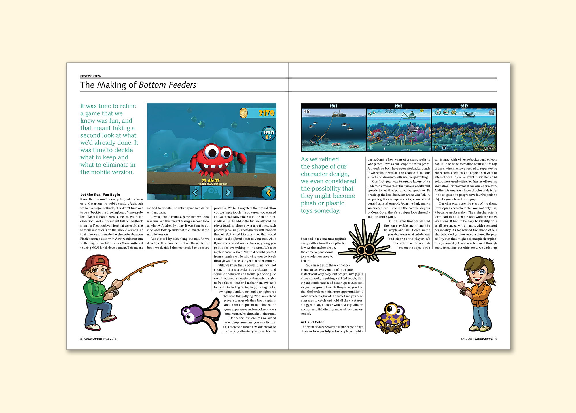
After seeing the results of my work helping to launch the Gamesauce publication, the director of the Casual Gaming Association asked me to give their flagship publication a facelift. To reflect the playful esthetic of the casual gaming space, I coupled an expressive slab serif with a quirky humanist sans serif, adopted a saturated print-friendly base palette, and used simplified geometric background patterns throughout. By limiting the palette and keeping it consistent from issue to issue, the rich and varied game art could take center stage without detracting from a cohesive look and feel. By establishing a simple, flexible template, and a cheerful, streamlined visual language, I was able to meet the tight turn around times without sacrificing consistency, quality, or a sense of delight.


